How to Make Changes on Desktop, Tablet, and Mobile
Introduction
Storagely’s Website Editor is built with responsive design in mind, allowing you to tailor the look and feel of your site across desktop, tablet, and mobile devices. While most content adjusts automatically, fine-tuning layout, spacing, and text size on each screen type ensures a smooth and consistent user experience. This guide shows you how to preview and edit your pages for every device, so your website looks great no matter where it’s viewed.
Navigating to the Editor
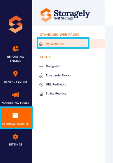
- Navigate to the Storage Website tab and select "My Websites"
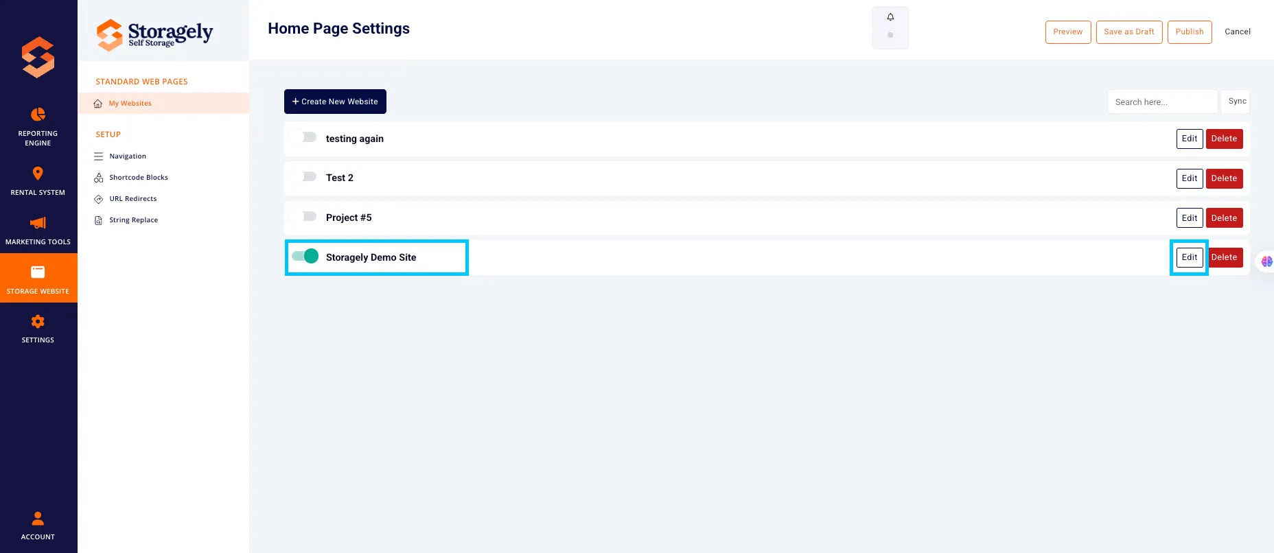
- Select the website you want to edit from the list
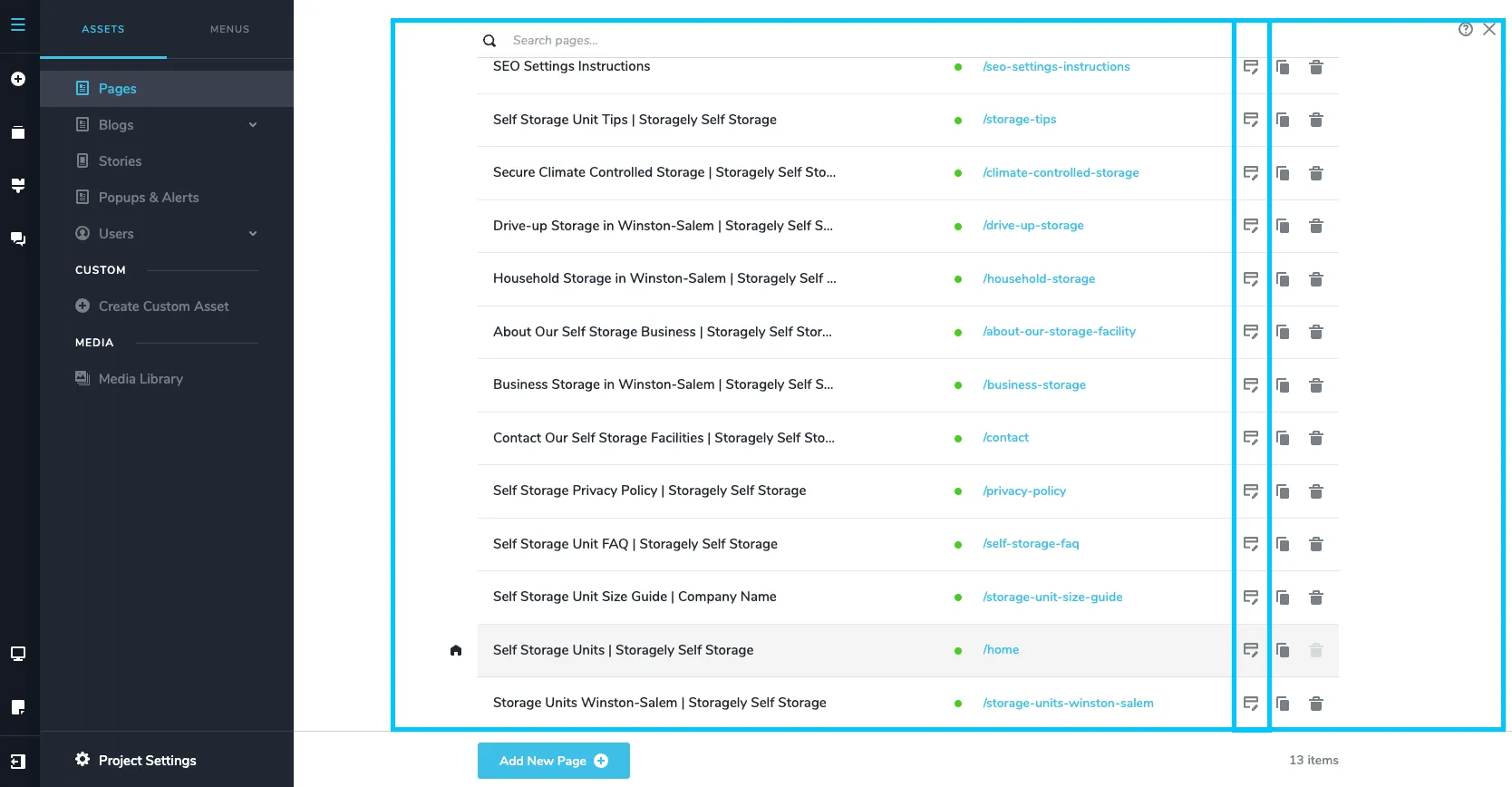
- Click the top left CMS icon

- Click the page containing the details or information you’d like to update.
To switch screen modes:
- Click the “Display” icon located in the left sidebar to access device-specific preview and styling options.
- Select either Desktop, Tablet, or Mobile view to preview and make adjustments for that specific screen size.

- Once in view mode:
- Any style changes (font size, spacing, visibility) apply only to that device.
- Structural changes (like moving sections) apply globally.
🎥 Watch Tutorial Video:
✅ Tip: Use device-specific adjustments—like text size, padding, and visibility—to ensure your content looks clean, readable, and well-spaced on mobile, tablet, and desktop. A few small tweaks can make a big difference in the user experience.
As always, if you have any questions during this process, our Customer Success Team is here to help. The best way to reach us is by submitting a support ticket.